
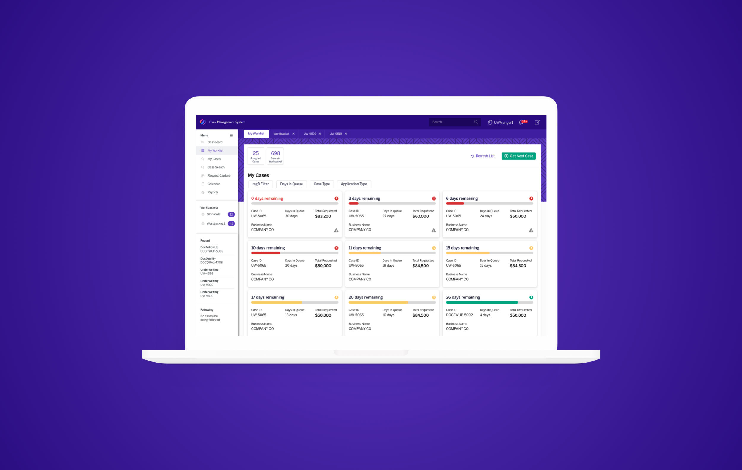
Case Management System
Problem
Client had an old case management system that hadn’t been worked on in a year. The project used an old design system and hadn’t been through a user experience design process. While the system solved many user problems, it was too convoluted to be usable.
Solution
The original request was to re-skin the existing UI to be more appealing to the eye but I took it upon myself to address the usability issues as well. A new user flow was introduced to improve usability by reducing the number of clicks and creating a wizard-like process to inform the user of the new workflow.
EXECUTION
Collaborated with client development team to learn how the system had been built previously
Worked with client management from different business units to gather requirements for cross-functionality
Redesigned the UI and user flow for improved data scanning and usability
Presented finished product to client global leadership
User Needs
As a user, I need to know which cases are assigned to me.
As a user, I need to know which cases are running out of time to complete.
As a user, I need to complete cases in a given time period.
As a user, I need to transfer my case to a higher empowered role when I am unable to complete it.
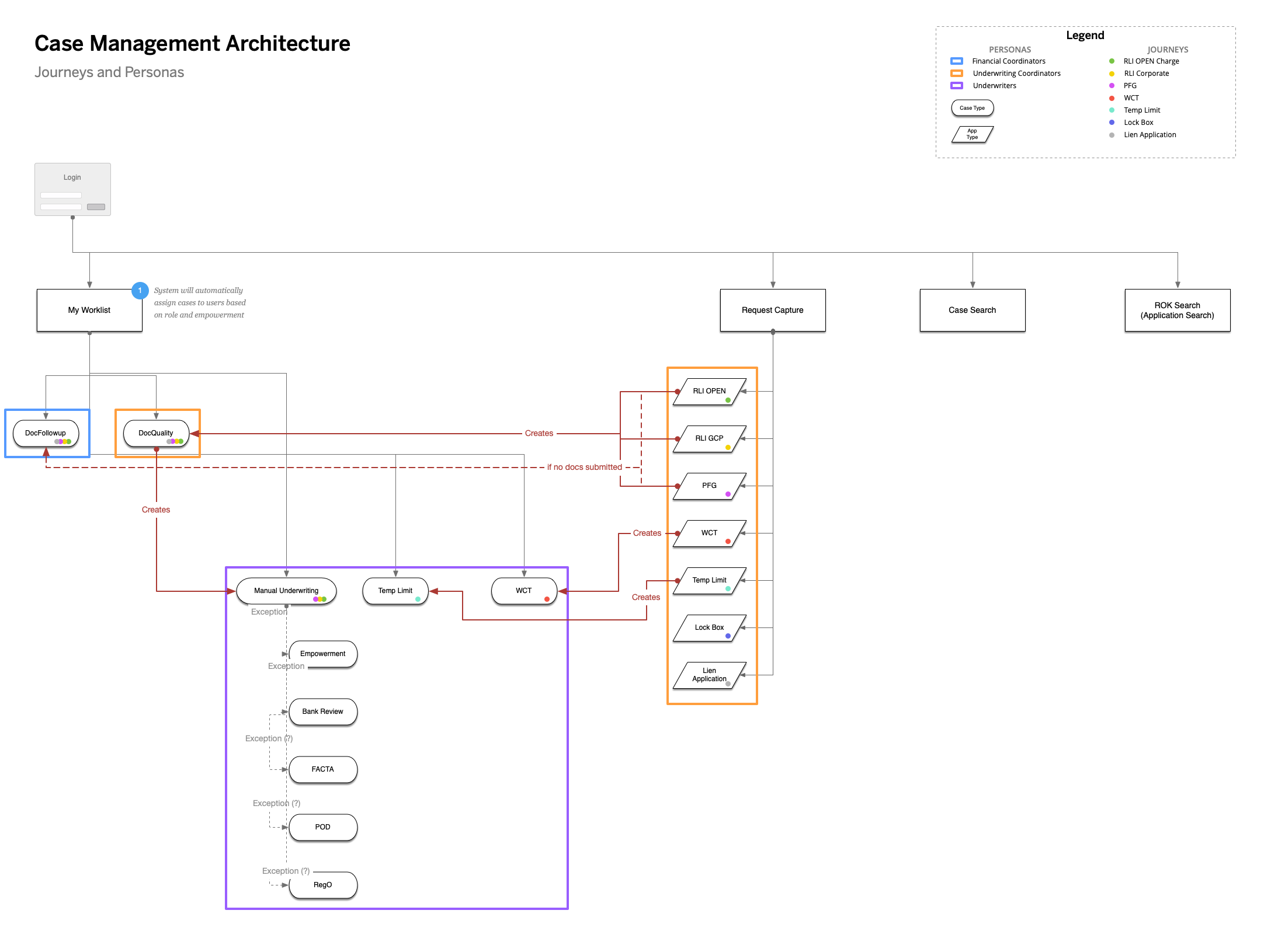
I created this architecture map to help me keep track of the growing system’s inner workings and to help communicate this better to future designers of the project
Pain Points
Current flow makes users have to open multiple windows
Current flow makes users have to work in multiple applications
New application design is outdated and looks like a grey spreadsheet
New application’s flow put everything on one page - in a nested table with nested tabs
Finishing one case typically took users at least an hour to fulfill
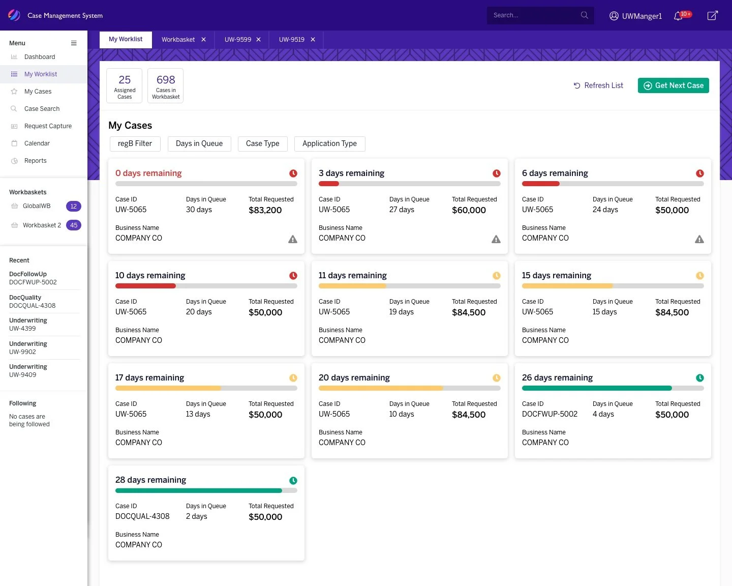
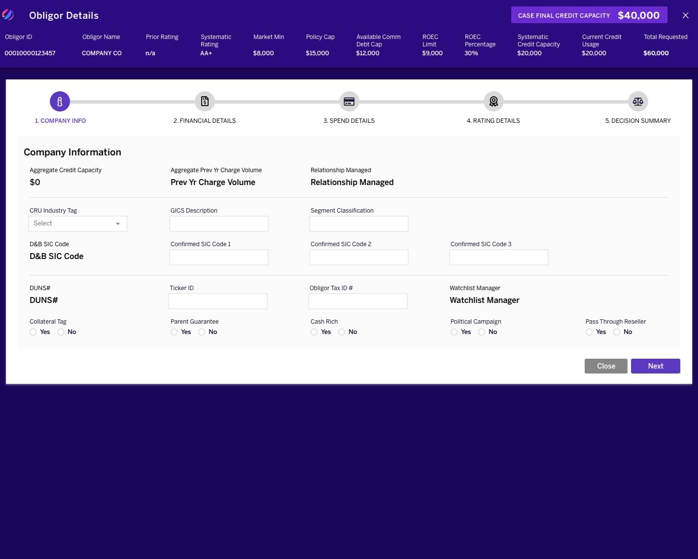
finalized visuals made greater use of color and iconography than the previous system to give users a quicker understanding of their workload case by case
Challenges
Needed to learn specific financial industry terminology
Needed to learn the system hierarchy
Needed to learn the new application’s workflow as it was different to what user’s were familiar with
Different level of users with different empowerments
Outdated design system meant limited capabilities
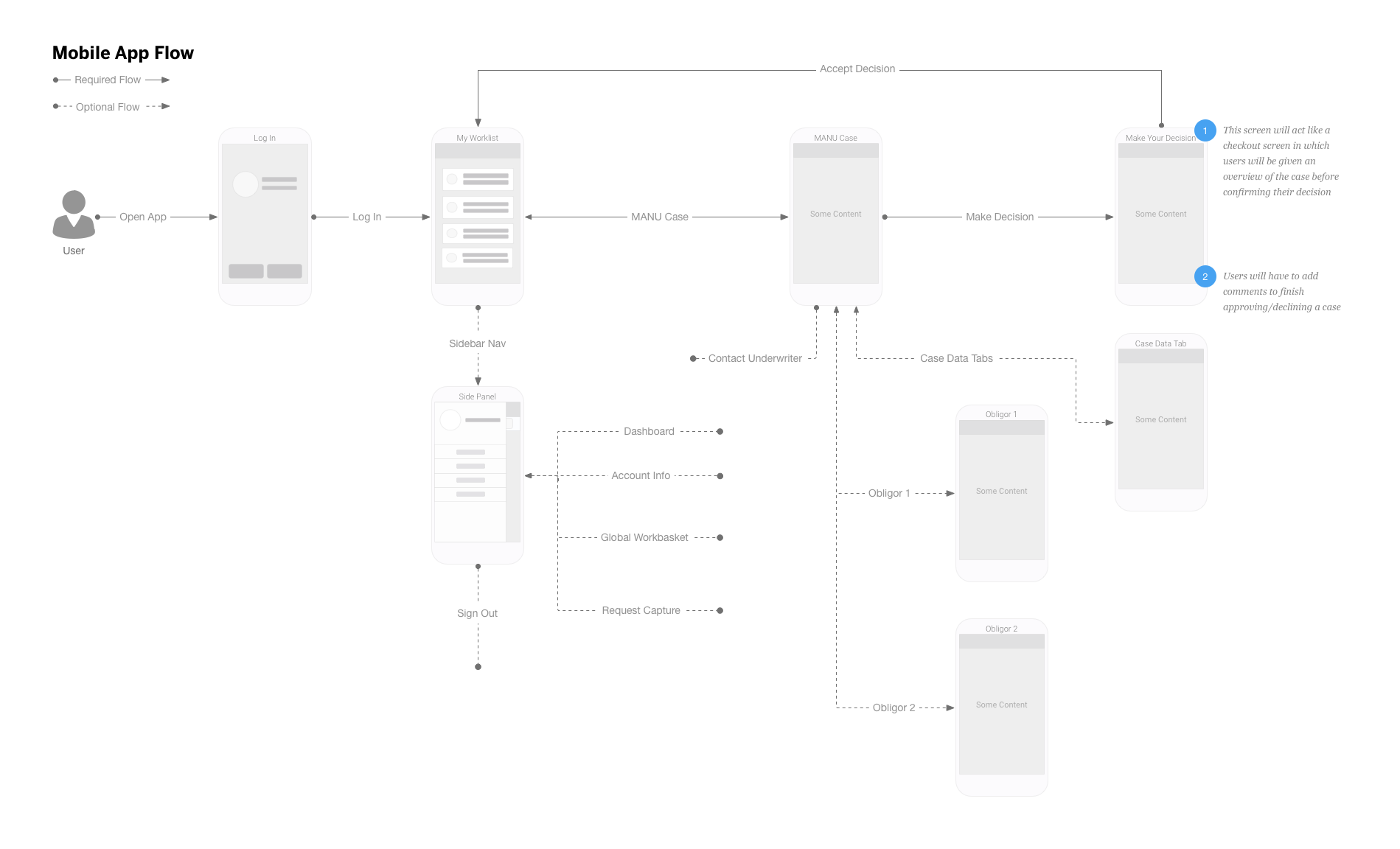
A mobile version of app would require the user to navigate more screens and clicks than the original design because of the limited screen space in contrast to the large amount of information needed to be shown to the user to complete their work
Conclusion
This is the most complicated system I have ever worked on mostly because I had to do a lot of “catching up” to even be able to understand what the business required from the system. After presenting my design to the client’s global leadership, my company’s contract was extended and I designed out the rest of the system which culminated in 1.5 years of work and over 200 screens designed. The desktop version was such a success for the client that the mobile app version of the system was developed.